Welcome back! Let’s continue ranking the most underrated and neglected MLB hats for each team. If you missed the first part of the series, check it out right here.
It’s time to try on some lids. My ranking of each team’s primary hat is in parentheses.
The “Low Usage, High Impact” Division
Minnesota Twins (3)
I love the Twins’ everyday lid. It has a great blend of colors, a sleek interlocked letter crest, and a unique symbol that reps the squad’s hometown(s).
I am not asking for the Twins to stop wearing these awesome caps…I just think we can give some shine to underutilized stars.
Play into nostalgia and rock these classic caps or go the opposite direction and select a popular contemporary favorite. Ultimately, I say let’s keep riding with the TC but turn heads with the weekend reds shown above (jersey included).
They’ll look awesome on weekdays too.
Colorado Rockies (21)
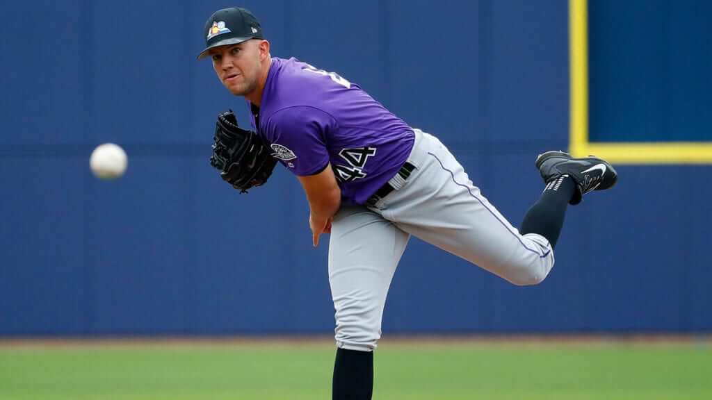
Roses are red, violets are blue, the Rockies should wear these cool BP hats and…
[Scrolls MLB Shop] “Why on earth aren’t you regularly wearing these hats, Rox?
At the very least give us a modicum of Purple Haze and bust out these hats more often!” [Sighs, then regains composure]
…and these other ones too!
Washington Nationals (27)
I would like more of the above please.
Respectfully, Nats, your primary cap looks like it should be worn by an employee of a pharmaceutical chain store (hint: not Rite Aid or CVS).
Bare minimum, I think this alternate should become the main act. My final decision: “Win” is spelled with a capital W, and the capitol hats will make you look like winners.
Baltimore Orioles (8)…unintentional homage
First, I applaud this organization for adopting this iconoclastic arthouse gem as their primary home cap.
Having said that, the Birds have a few flock members that I think deserve more attention. You may say the simple “O’s” logo looks better suited for a cereal box than a baseball hat; I say it makes a clean, versatile cap.
I know someone who agrees. But alas, the team’s best option is the beauties shown above. Let the batters flip bats, and let these birds fly!
The “Who Needs A Time Machine” Division
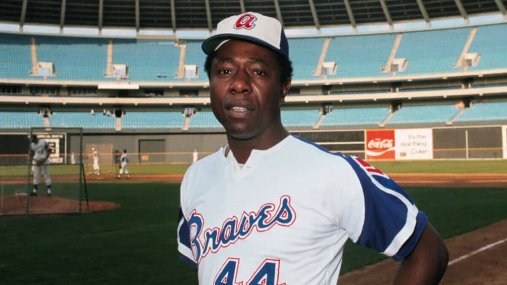
Atlanta Braves (16)
These hats are cool even when uncovered by gloves. To be clear, I have no problem with the squad’s primary hats, especially those with the red brims.
I just think a little change is nice once in a while, especially if it pays homage to a king:
Chicago White Sox (7)
If I weren’t a loyal Cubs fan, there is a ninety-eight percent chance I would have owned one of these caps during my formative years. It’s an undeniably cool design, even if it reminds me of my contempt for A.J. Pierzynski.
However, Chicago gets hot during the summer, and I think some lighter hues may be necessary. Luckily, you have slick alternates ready to pinch-hit.
I’m partial to the ones with the batter, but I appreciate the simplicity of the “SOX” option. Either way, it means you’re wearing these uniforms, so everybody wins!
Now for some classic cinema.
Los Angeles Angels (23)
Giving away some throwback hats sounds like a good way to end #NationalHatDay & #ThrowbackThursday, right? RT to win! pic.twitter.com/YzBnrv9emJ
— Los Angeles Angels (@Angels) January 16, 2015
Hypothetically, if this team returned to the California Angels brand, would anyone really be upset?
I mean, sure, the Dodgers are the most iconic brand in the state; the Giants boast legendary pedigree and recent championship glory; the A’s have Moneyball fame and a track record of consistent success on a minuscule budget; and the Padres are… also a team that resides in the state.
But calling this team the California Angels feels right and reminds us of our favorite fictional underdog squad. Plus, if it means bringing back these old friends and these heavenly creations how can anyone reasonably object?
To quote a wise young man: “It could happen.”
Los Angeles Dodgers (2)
Much like how their neighbors should wear caps honoring their previous brand, the Dodgers should (figuratively) return to Brooklyn more often.
Now as you can see, Dodger Nation, I hold your everyday hat in high esteem. But I like variety, and I love these hats.
A perfect accessory with any summertime outfit.
San Diego Padres (19)
We will continue posting this (so, always) until it no longer warms or fills our heart (so, never)@La_Mole_13 • #FriarFaithful pic.twitter.com/gJAH5WCymF
— San Diego Padres (@Padres) June 1, 2019
Some find the Friars’ hats drab, but I think they’re a good look. I say this first to cushion what I’m about to say…what were y’all thinking abandoning these perfect tens?
At least they occasionally kick it old school with these Anchorman-era lids. You know what they say: those who forget the past are doomed to wear mediocre hats.
Then again…I’ll settle for these. You’ve got options, San Diegans.
For an introductory look at our dissection of the most underrated MLB alternates, check out Part One here. To continue the series, check out Part Three here.