Summer is fast approaching, which means it’s time to talk about the most necessary seasonal fashion accessory. I’m not talking about sunglasses or sandals, I’m talking about lids.
The baseball cap is a perfect complement to any outfit in most situations. In fact, some of these hats are so beautiful that you can probably get away with sporting it at a Michelin-starred restaurant.
Unfortunately, some MLB teams are underutilizing their most pristine hat choices.
As a result, I have taken it upon myself to offer some sage advice to all thirty squads about embracing fun and showcasing their best features. I have long been an admirer of great baseball caps, even before my hair decided to retire.
I believe that the elements of a great cap design include its color scheme, logo, and uniqueness. For example, the New York Yankees’ cap is simple yet perfect. The white letters on a navy backdrop, the iconic nature of the interlocked NY, and the immediate brand recognition combine to make this a minimalist gem.
I’m not a Yankees’ fan, but I respect the realest cap in the game when I see it. Having said this, ninety-nine percent of the spinoff Yankee hats are atrocious and borderline blasphemous.
So, to put our underdog spin on the spirit of Uni Watch — a site dedicated to “the obsessive study of athletics aesthetics” — I will be focusing on the underrated and neglected MLB hats for each team in this piece.
Even if the teams spurn my wisdom, I encourage you all to treat yourselves this summer and pick out a couple new hats to shield yourselves from the afternoon sun.
I have sorted them into divisions ranging from those that are backup options for a reason and finishing with those that should become mandatory uniform pieces for their respective teams.
Without further ado, let’s try on some lids. My ranking of each team’s primary hat is in parentheses.
The “Play to Your Strengths” Division
New York Yankees (1)
We may as well begin with the Yankees since their everyday cap is unimpeachable and therefore no alternate hat has a fair chance to crack the rotation.
Still, the Evil Empire does have some clean options for fans looking to shake up the status quo. The hats they wore on Mother’s Day had a subtle elegance, and the Spring Training/Batting Practice hats are solid.
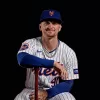
My top choice is their Players Weekend caps (shown above). Not as good as the original, but neither is any other hat.
Bonus points for the fact that this hat with its gray base and navy brim and lettering is a great winter piece as it will look good with winter coats.
Cleveland (28)

The script “I” hat is alright, but it doesn’t represent anything unique about the city or the team. The everyday cap is relatively drab, and I think they are better off going with a red base and blue lettering (or at least a red brim) if they are committed to this design.
Ultimately, I would lean into the throwback uniforms and ditch the block “C” hats for the Cooperstown Collection cap shown above.
Texas Rangers (24)
The Rangers sport a clean, simple cap. As an aspiring minimalist, I respect their less-is-more design philosophy.
If the Rangers’ ownership/celebrity stylist (I don’t know how these things work) wants a cap that embraces its location, I can get onboard with the lid Hunter Pence is sporting.
It goes against my budding minimalism, but y’all know Texas’ state mantra…I don’t think they do minimalism.
Despite these sentiments, my gut instinct tells me to keep the simple design but change the color. Behold. I, too, would be pumped to wear this hat to a barbecue.
Kansas City Royals (18)
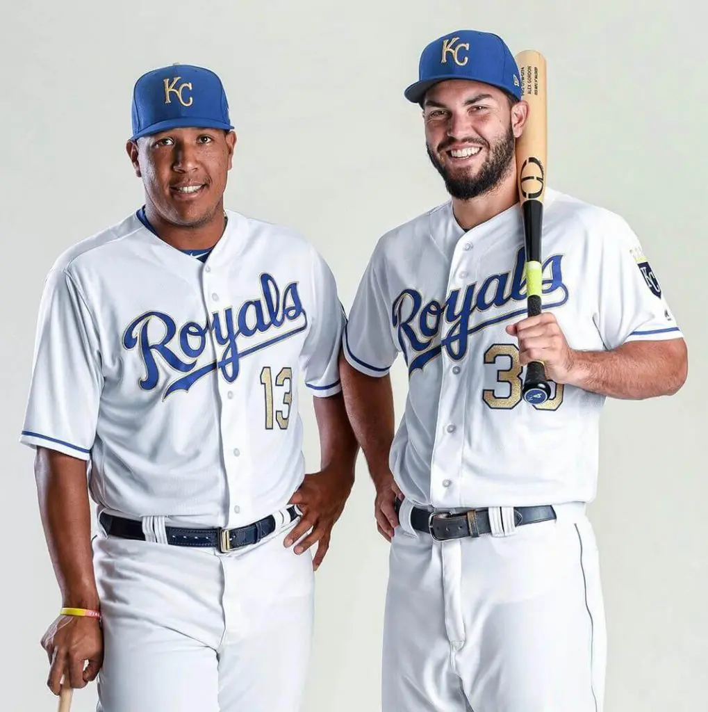
I like the Royals’ hats a lot. Probably more than most, which is why you may disagree with my parenthetical ranking. I find myself quoting Billy from School of Rock as I review my options.
Their All-Star Game hats are flame emojis, but I’m sure there are rules against wearing these during regular games. Their Mother’s Day and Father’s Day hats are also subtle beauties, but I assume they reserve these solely for their respective special days.
Finally, I remembered…the gold letters! This is headwear befitting of royalty, folks. I thought about making an Outsiders reference but y’all can fill in the blanks.
Miami Marlins (26)
Best selling hat in Marlins team store, I’m told. These are the only ones left, more on the way. pic.twitter.com/At1LYQQ02i
— Andy Slater (@AndySlater) April 1, 2018
I’ve never been high on the Marlins’ uniforms, but I actually enjoy the direction they’re heading with uniforms. (“Too bad their front office always steers the roster in the wrong direction”– Statler & Waldorf chime in from the otherwise empty upper deck in Marlins Park.)
Rude jokes aside, the everyday cap is solid. I think we can do better though, Marlins Nation. I prefer the simplicity of this alternate; but you know what I prefer even more?
The teal! The consumers have spoken (see “Fan Favorite” designation), time to listen for once.
P.S. If they follow the Heat’s lead and develop “Miami Vice” uniforms, ignore everything else I said and buy the corresponding hat IMMEDIATELY.
Detroit Tigers (10) & San Francisco Giants (13)
Ok I’m going eco-friendly and saving space by giving the same advice to these two squads. I have a modest proposal: add a little orange to an otherwise great baseball cap. For the Detroit faithful, you can add a whole bunch of orange and bust out this option once in a while.
My official recommendation as a hat connoisseur is to wear the hat that makes the people smile.
For the Giants, just brighten up that brim and adopt these full time. Celebrate Halloween all summer in the Bay!
Stay tuned for the other three divisions of the most underrated MLB lids, and please be gentle with your criticism of my fashion sensibilities in the comments section.

